Here are some of our best visualizations of the past twelve months.

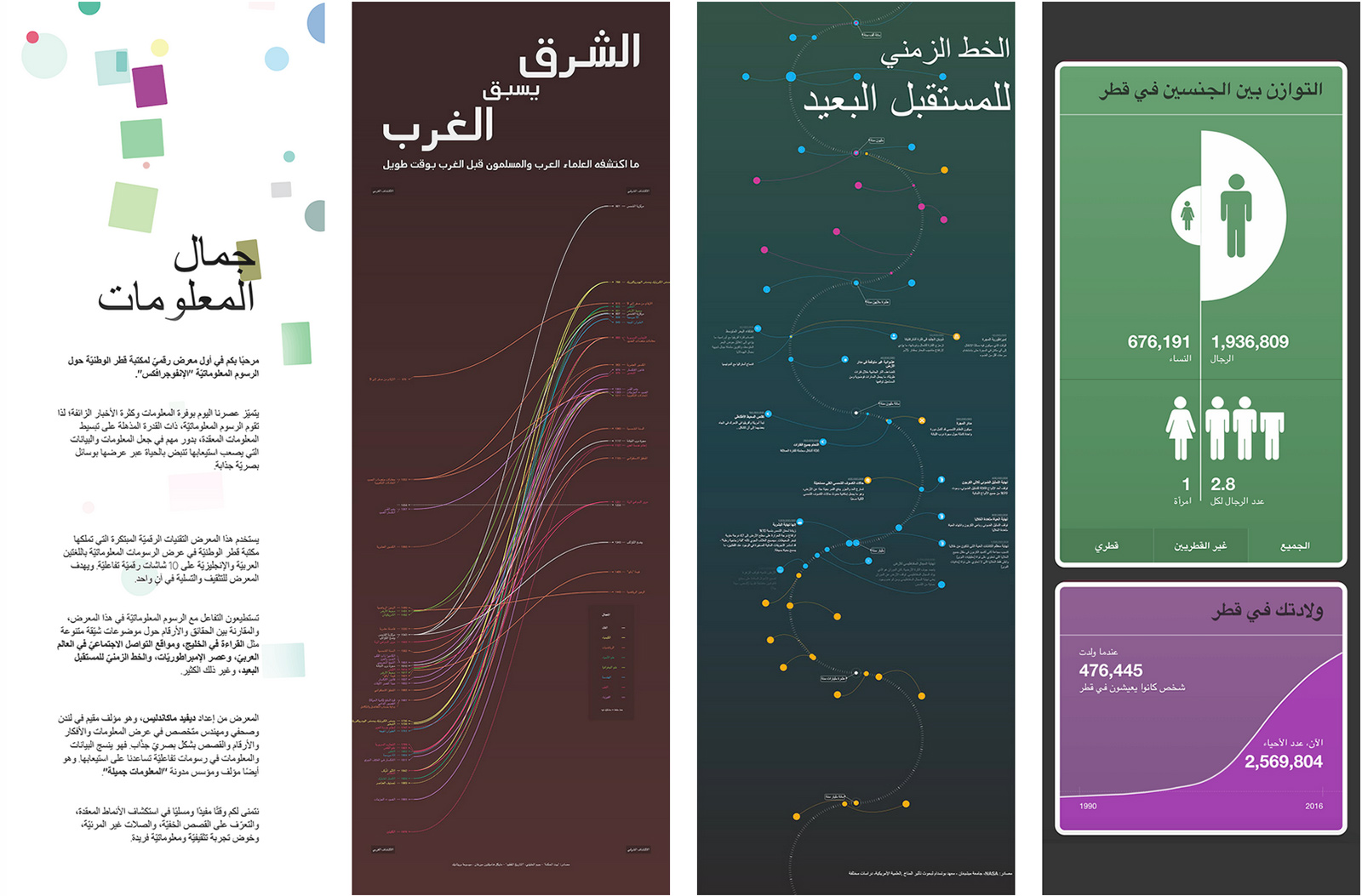
Our first exhibition took place at the recently opened, Rem Koolhaas-designed Qatar National Library. We created ten interactive data-visualizations on a series of three-metre touchscreen totems, one face in English, the other Arabic. Subjects included the history of civilisation, Middle-Eastern science, and a timeline of the Far Future. So just some small topics! And we learned that data visualizations look beautiful in Arabic.

One graphic was a timeline of what Islamic thinkers discovered long before the West. Sure you’ve heard of Copernicus, Fibonacci and Fermat. But what about Ibn al-haytham, al-Bīrūni, al-razi – the often uncredited Islamic Golden Age scholars who inspired and informed their discoveries?

2018 was a big year for marijuana legalisation. There were victories for campaigners in Canada, Vermont, Oklahoma, and California, as well as Thailand and New Zealand for medical reasons. But what medical conditions are marijuana / cannabis and CBD (Cannabidiol) actually effective for? One graphic, all the evidence.

A rebuild of our Microbescope graphic, comparing different diseases. New data. Fresh interactivity. And a suite of interactive stories around the data. Go take a look.

We marked Apple’s trillion-dollar valuation with a Trillion Dollar-o-Gram. Now you can literally see what this mind-boggling amount looks like.
A few more honourable mentions.
- The Brexit options available to the British.
- A Drake Equation calculator to figure out the chance of intelligent alien life.
- Charting, with the World Cancer Research Fund, the latest science on how diet, nutrition and physical activity affect cancer risk.
- An interactive glossary of (possible) technology-induced mental disorders.
- A 2018 remix of our visualization of Wikipedia’s longest (and lamest) edit wars.
In 2019, we’ll finally release our data-visualization software, VizSweet, and we’ll be unveiling a huge new top-secret project that we know you’ll love. Stay tuned!

