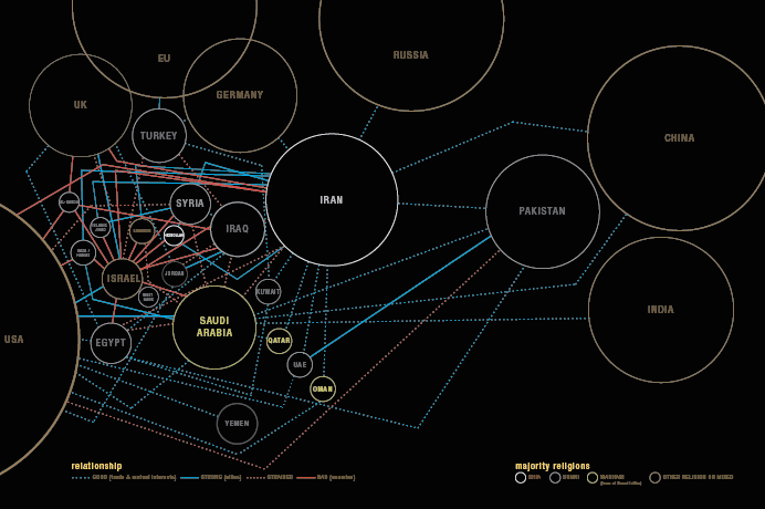
An interactive visualisation of key players & notable relationships in the Middle East created by David McCandless & Univers Lab. Part of the Knowledge is Beautiful project. Powered by our dataviz software VizSweet.
» Explore the visualisation
» See the data: bit.ly/KIB_MiddleEast
about this image
This is an interactive remake of a prototype image from my first book, Information is Beautiful (2009). And part of a series of graphics exploring different facets of Islam.

This kind of visualisation is called a “forced network” where the entities are bound in a mesh of connections. Seemed like an appropriate form, given the density and complexity of the Middle East situation. It’s also meant as a kind of visual joke. The complexity is nearly off-the-scale, displaying how such an intricate, matted fabric defies simple solutions.
Understandably, this is an ongoing, evolving diagram which we hope to add to. So, as ever, we welcome your ideas & corrections & clarifications.
Knowledge is Beautiful, my new book of 196 data-visualisations, out this autumn.

