Massive congratulations to the innovative, imaginative & intrepid winners of 2018’s global Information is Beautiful Awards – a celebration of the world’s best data-visualisations and infographics.
Trimming down 100 world-class shortlistees to a handful of exceptional winners was a fierce challenge for our panel of expert judges & community voters. Given such unrivalled ambition & scope – graphic novels, mosaics, even play-doh – this year’s accolades, trophies and $30k in cash prizes (courtesy of beloved sponsor Kantar) are very well deserved.
Scroll down for the ultimate winner.
Gold, silver & bronze category winners in the entry showcase:
Arts, Entertainment & Culture | Humanitarian | Leisure, Games & Sport | Maps, Places & Spaces | People, Language & Identity | Politics & Global | Science & Technology | Unusual
Special prizes
Community Vote = Historia de Zainab by Visualizar
![]()
Impressive Individual – Lena Groeger for work including What Happened To All The Jobs Trump Promised

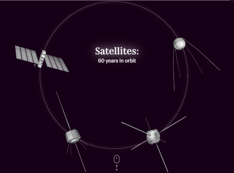
Non-English Language – Satellites: 60 Years in Orbit by Rossiya Segodnya

Outstanding Outfit – Reuters Graphics for work including Good Dogs

Rising Star – Roni Levit for Physical Intervention in Public Space

Student = 30° by Stephan Schakulat, Mathias Foot, Janna Nikoleit & Franziska Rast

Student = Shifting Gears: Visualizing Cycle Rides by Hardik Chandrahas
Most Beautiful – $7,500 prize
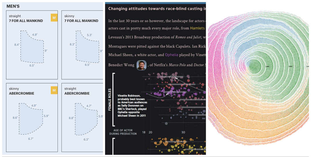
Simulated Dendrochronology of U.S. Immigration 1790-2016
by Pedro M Cruz & team with Northeastern University & National Geographic
» All 2018 winners
» All IIB Awards winners ever
» 2018 shortlist
» 2018 longlist
» Judges


