Dataflow 2 is a collection of the latest data visualizations and information graphics sprouting from the fledgling infoviz scene. Everything’s here: computational art, newspaper infographics, academic spidergrams. Although there is a strange absence of work from Information Is Beautiful. Grump!
Nevertheless, it’s a generous pie-slice of interesting and intriguing and WTF? work from international designers big and small. All large-printed on lovely shiny paper. Worth a look.
You can order it on Amazon US and UK. DataFlow 1 is also a seminal collection (US | UK).
Highlights
Here are a few of my favourites from the book.
(Disclosure: The publisher Gestalten sent me a free review copy.)
Rosemarie Fiore
This New York based artists took long exposure shots of classic video games, revealing the hidden logosof the game, normally unseen by the eye. See if you can guess the game…

N.B. Her visualisation of the hidden paths of amusement park rides are also pretty wow too.
Zero By Zero
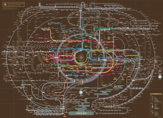
Amazing South Korean studiospecializing in modern re-mixes of railway maps. Better looking, cooler curves, characterful detail. Here’s Tokyo

They’ve recently just re-envisioned the London Underground map too.
(Their site is chunking a bit. But you can check out their Flickr)
Golden Section Graphics
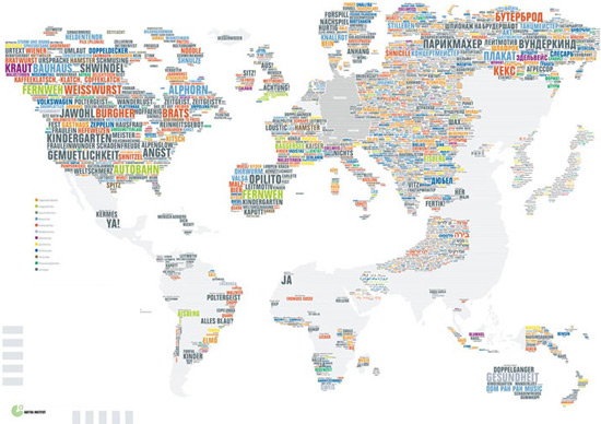
I really like the work of this German infographic design outfit, especially when they pare it all down to the essentials. This graphic of exported German words used around the world exemplifies their awesome-ness.
Other work for German newspaper Die Zeit ist wunderbar also.
Life Map
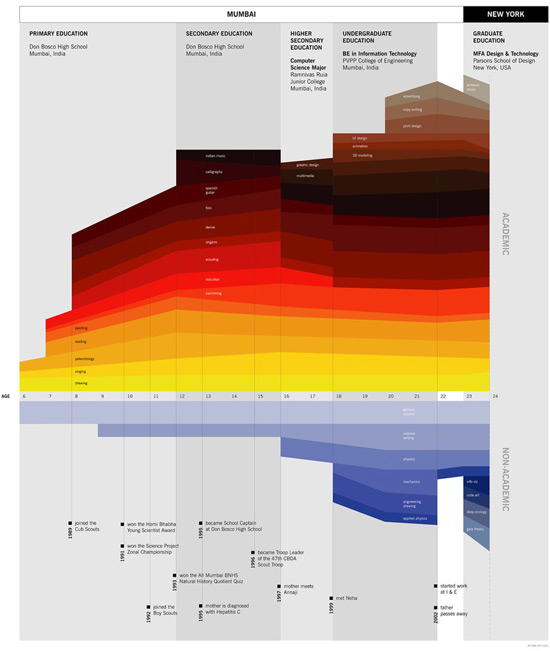
This is old but gold. Information designer Ritwik Deydecided to make his life look beautiful and visualised his CV. Four years later it’s still a stunning piece of info design.
If you’re intrigued by DataFlow 2 you can order it on Amazon US and UK. DataFlow 1 is also a seminal collection (US | UK).


