With the help of the excellent Guardian Datastore, we’ve been tracking Swine Flu (“novel H1N1 virus”) as it creeps across the globe and starts to feeds into the autumnal ‘flu season. There are some surprising results.
Is the US about to face a pandemic?
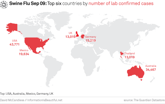
The USA still has the most cases in the world. The America media are starting to pump out alarming headlines. “200,000 deaths!”. Here are the current figures.

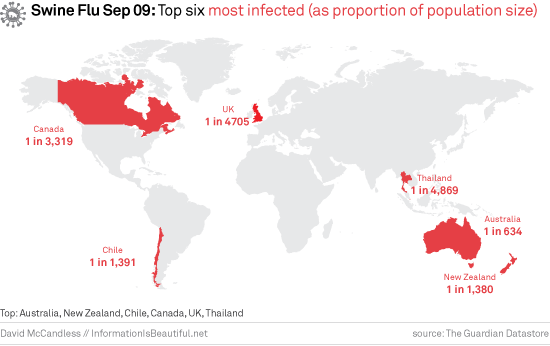
But when you factor in population sizes, the USA disappears off the map. (It’s actually 15th in the world)

Fatality rates: Is Swine Flu getting deadlier?
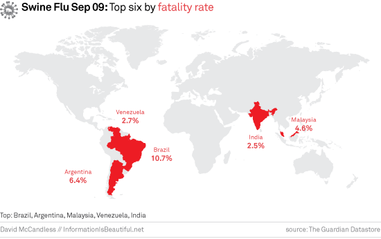
When you look at fatality rates for Swine Flu, the percentage of infected people who die, the results are depressingly unsurprising.

Although these nations have much fewer cases than Western nations, far more people are dying. Brazil’s fatality rate is a shocking 10%, against a world-wide average of around 0.3-0.5%.
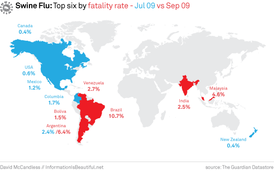
When you compare these worldwide fatality rates against those from mid-July, you see a slightly worrying trend.

Swine Flu appears to be becoming more deadly in Latin America. Is this down to Western nations use of Tamiflu?
Swine Flu Advisory
Here’s the overall data in a table. Media reporting generally only focuses on the first column. But we think the other columns are more relevant.
The stand-out statistic from all this is the US’s death rate at 1.2%. It’s the only Western nation in the above-average rankings.
This may be down to Swine Flu’s particularly lethal interaction with obesity. An estimated 34% of American’s are obese (CDC)

If you are interested in more, you can see a live interactive table of Swine Flu figures here.
Sources and data in this Google Doc.

