I’ve been doing a few interviews to promote my book, The Visual Miscellaneum, and a question keeps coming up. What makes good information design?
This is the point where I go a bit glassy. To be honest, I don’t know. I am unschooled in both information (I was a college dropout) and design (I am a self-taught designer). I’ve never really thought about it.
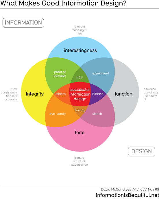
So, I made a nice cup of tea and had a think and came up with this.

To me, these seem like the key components of a good infographic / data visualisation / piece of information design.
- Information needs to be interesting (meaningful & relevant) and have integrity (accuracy, consistency).
- Design needs to have form (beauty & structure) and function (it has to work and be easy to use).
You may disagree. I welcome your input. I may not have got it right.
Something surprised me about doing this though.
In information design, it seems, if you have just two elements, you get something tolerable and cool. i.e.
- integrity + form = eye candy
- interestingness + function = experiment
(I’m not entirely sure about these combos)
But if you combine three elements without the fourth, things suddenly FAIL:
- interesting subject, solid information, looks great, but is hard to use = useless.
- amazing data, well designed, very easy to read but isn’t that interesting = boring
What do you think? This is a work in progress. Can you help me shape this a bit? Have I missed anything?

