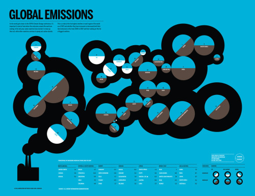
The Change In Carbon Emissions
Another beautiful viz from Good Magazine. This time by Spanish viz supremo Lamosca. Twinned with Kyoto Targets.
Your pet’s CO2 pawprint
How much CO2 is that doggy in the window? [Via Good Magazine and NewScientist]
White fight or flight?
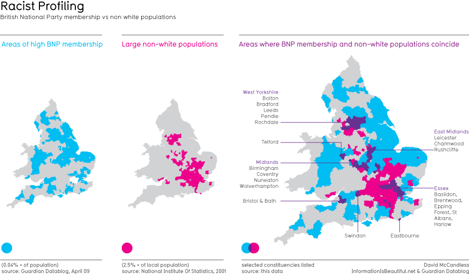
Here’s a little something I did, overlaying membership data from the racist British National Party and ethnic populations in the UK. See the full size image.
300 days of Swine Flu
Nice image from Michael Paulkner showing the death toll from Swine Flu after 300 days. Larger sizes here.
Blimey. Quite a lot of doom and gloom in those images. I’ll try to make the next one cheerier.
If you’re still hungry for more infographical morsels, check out the last selection.
In the meantime, if you come across any visual delights, please send them through.


